What is a homepage structure and why it drives conversions
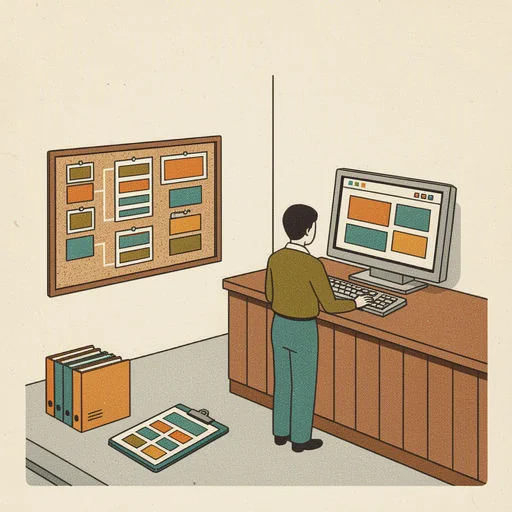
The concrete outcome you’ll achieve by reading this article is a ready-to-apply plan. You’ll know exactly which homepage layout pattern to deploy for your local business or SME. How to adapt it quickly, and how to structure content for faster conversions. By 2026, a well-structured homepage website remains one of the most cost-effective levers for turning visitors into leads. Bookings, or sales in local markets.
What is a homepage structure and why it drives conversions
The structure of a homepage is the deliberate arrangement of hero messaging, content sections, social proof, and calls to action. It’s not mere aesthetics; it determines how quickly visitors understand what you offer and what to do next. A clean hierarchy reduces friction, speeds up decision-making, and increases the likelihood of engagement. For local businesses, a well-ordered homepage can outperform a visually stunning but confusing page. Especially when the goal is to drive inquiries, bookings, or visits to a physical store.
- Key principle: start with one clear value proposition in the hero, then build trust with evidence and a repeated, accessible CTA.
- A/b testing tip: try variations where the primary CTA text is specific (e.g., “Book a Free Consultation”) versus generic (e.g., “Learn More”) to see which yields higher response in your local market.
A well-structured homepage helps users move from curiosity to action with minimal friction.
Clarity in the hero message accelerates trust and reduces hesitation.
The 10 free homepage layouts (wireframes) for 2026
Each pattern below includes a quick “how to use it” guide and a pointer on when it’s most effective. They are practical, not decorative, and can be implemented with simple edits to existing pages or new sections on your site.
1) Hero Centered
- How to use: Place a single, bold message and a prominent CTA at the center of the hero. Keep supporting text minimal to preserve impact.
- When to use: Strong brand identity or a unique value proposition that doesn’t require heavy supporting details up front.
2) Hero Split
- How to use: Left side explains value; right side shows supporting imagery or a short video. CTA is visible and aligned with the value statement.
- When to use: Services and agencies that want to balance value with context and social proof.
3) Hero Fullscreen
- How to use: Image or video fills the hero with a tiny headline and a single CTA. Minimal copy reinforces an emotional or aspirational message.
- When to use: Brand storytelling, lifestyle branding, or high-end products.
4) Video Hero
- How to use: A video plays in the hero with concise headline typography layered on top. Focus on motion and emotion.
- When to use: Brand campaigns, tourism, fashion, or tech with dynamic visuals.
5) Navigational Focus (Guided)
- How to use: A clear, multi-step path is presented in the hero area guiding users through key services or steps.
- When to use: Complex products, platforms, or multi-service businesses where users benefit from a guided journey.
6) Scroll Storytelling
- How to use: Vertical sections each delivering a distinct message or benefit; keep each section with a distinct CTA.
- When to use: Brand storytelling, case studies, long-form value demonstrations.
7) Modular / Sectional
- How to use: Reusable blocks that can be rearranged as content grows. Each module has a focused purpose (e.g., features, testimonials, pricing).
- When to use: Growing service businesses or agencies with evolving offerings.
- Minimalist
- How to use: Very few elements, lots of white space, a strong value statement, and a single, obvious CTA.
- When to use: Premium branding, professional services, or anything where clarity beats clutter.
9) Product / E-commerce Focus
- How to use: Show the primary product or service with immediate benefits and a strong product CTA above the fold.
- When to use: Shops or SaaS with a clear flagship offering and a fast path to conversion.
10) Dashboard Style
- How to use: A clean, data-like layout that emphasizes organized categories, quick access to actions, and concise benefits.
- When to use: Portals, marketplaces, or platforms where users navigate through sections and tasks.
A few concrete tips to apply these patterns quickly
- Start with one clear objective per page: lead capture, appointment booking, or product sale.
- Choose a primary CTA and keep its text consistent across sections to reinforce the action.
- Use social proof near the CTA to reduce hesitation (logos, testimonials, review counts).
- Ensure mobile performance: prioritize readability, tappable CTAs, and fast load times.
How to pick the right layout for your local business
Choosing the right layout is less about aesthetics and more about user intent and content constraints. Start by mapping your top objective (drive store visits, book appointments, or sell a product). Then consider:
- What’s the strongest proof of value you can show quickly (customer logos, star ratings, short testimonials)?
- Do you need to explain a process or service in steps (Guided or Scroll Storytelling)?
- Is your primary offer a single product or a suite of services (Product Focus or Modular)?
Practical decision aid:
- If you want a powerful first impression with minimal friction, consider Hero Centered or Minimalist.
- If you must communicate multiple services or steps, Hero Split or Guided Navigation often works better.
- For storytelling or long-form value, Scroll Storytelling engages visitors over time.
Anatomy of a conversion-friendly homepage
Regardless of pattern, certain elements reliably improve performance:
- Clear hero with a benefit-driven headline and a primary CTA above the fold.
- A visual hierarchy that prioritizes message, proof, and action in that order.
- Social proof near the CTA area to reassure visitors as they consider conversion.
- Repeated CTAs along the page so users don’t have to scroll back to the top to convert.
- Fast-loading content and accessible typography, especially for mobile users.
Incorporating these elements is less about trendy visuals and more about disciplined structure and copy that aligns with user intent.
A structured layout reduces friction and speeds decision making.
SEO and the homepage: why structure matters
A well-structured homepage supports search visibility and accessibility. Use a single clear H1 that reflects your main keyword focus, followed by coherent H2s and H3s that segment content. Textual content should live in addition to any imagery so search engines can understand your offerings. Load times and mobile responsiveness also influence rankings. A fast, accessible homepage with meaningful headings tends to perform better in search results and in voice/artificial intelligence outputs that summarize page content.
Common pitfalls to avoid
- Overloading the hero with multiple messages or conflicting CTAs.
- Relying solely on images for messaging; include accessible text that describes the offer.
- Using desktop-first layouts that don’t adapt well to mobile devices.
- Neglecting social proof or failing to connect proof to the CTA.
- Creating a generic homepage that doesn’t clearly convey value or next steps.
How to implement these layouts on a budget
- Start with your existing CMS or website builder and map the 10 wireframe patterns to sections you already have.
- Create a one-page wireframe for the hero and core sections
Related articles
-
 Digital Trend Natale 2025: come stanno cambiando la comunicazione delle feste The introduction shows how to convert online interest into bookings, calls, or foot traffic by applying the Digital Trend Natale signals to local marketing. Read article
 -
 Comunicazione visiva 2026: what changes for brands that want to be noticed The phrase comunicazione visiva 2026 captures the need to plan visuals with strategic intent rather than rapid volume. Read article
 -
 Google Pixel 11 Pilot Guide for Small Businesses: Watch, Tag, Tensor How Pixel 11 phones, the Tensor G6 chip, the Pixel Watch and the Pixel Tag turn into a 30-day pilot with real KPIs for a restaurant, salon, gym or shop. Read article
 -
 Accelerate small content workflows into a one-day production loop This article will show how to accelerate small content workflows into a single-day production loop. Read article